

I love data. Quotes. Documents. Recordings. Photographs. Numbers. I love it all, but numerical data are my favorite. Numerical data can be found everywhere! Your favorite baseball player’s batting average. The energy saving costs on appliances. Your favorite movie franchise’s profits. The number of satisfied customers that companies like to advertise. Your car’s mile per gallon. The number of people who attended a school event. All data! But with all this data around us, we need to know how to consume it.
Let’s look at an example*:
Take a look at this advertisement for the brand-new weight loss drug: Weigh-Gone. There is some impressive data in there. A weight loss pill that is 90% effective and customers lost 10 pounds in only 2 weeks?
Sign me up!
But there’s more to those numbers than meets the eye. Let’s go over them one at a time.
*Disclaimer: The accompanying flyer is created solely for this blog post and is not a real product.
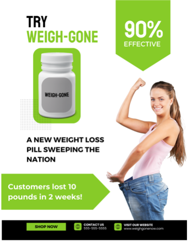
“90%”: Using percentages is a common practice in advertisements, but they don’t tell the whole story. How did they get 90%?
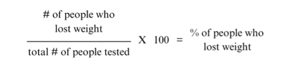
Let’s do a math refresh of how percentages are calculated. A percent, or per 100, is calculated by taking part of a number (e.g., people who lost weight) and dividing it by the total number (e.g., total number of people tested), then multiplying it by 100. Which means it’s possible 900 out of 1,000 customers or 9 out of 10 customers lost weight.
That’s a huge difference in the number of people tested!
“Customers lost 10 pounds in 2 weeks”: This is straightforward. It’s easy math: use Weigh-Gone and I’ll lose 10 pounds in 2 weeks. But is that what their numbers are saying?
It could be that customers lost 10 pounds combined, which is not very impressive no matter how many customers they have. For example, if the total number of customers is high, let’s say 1,000, it means each customer lost 0.01 pounds in 2 weeks. On the other hand, if the total number of customers is low, let’s say 10, it means each customer lost 1 pound in 2 weeks.
Neither of those are as impressive as what the data suggested on the flyer!
So the next time you see a percentage or numbers, ask questions. What do those numbers mean? How did they get them? Data is a wonderful tool in our everyday lives to empower us to make decisions that impact our well-being, but we need to ask questions so we know whether to trust or not trust the data.
Meet the Author
Dr. Megan Mikesell is a Program Manager with The EdVenture Group. Megan completed her doctoral program at West Virginia University (WVU) focusing on Human Development and Family Studies, specifically on early childhood educators’ attitudes toward addiction and how it relates to their relationships with students.
Prior to joining The EdVenture Group, Megan worked as the program coordinator for Project TRAIN (Teacher Resources for Addiction Impact Now), an initiative at WVU that seeks to meet WV K-12 teachers’ expressed needs regarding the impact of the opioid crisis. Megan is excited to bring her human development expertise to work with a passionate, like-minded team whose primary goal is to support families, schools, and communities for a safer and healthier future.